ShopDreamUp AI ArtDreamUp
Deviation Actions


Suggested Deviants


Suggested Collections


You Might Like…


Featured in Groups


Description
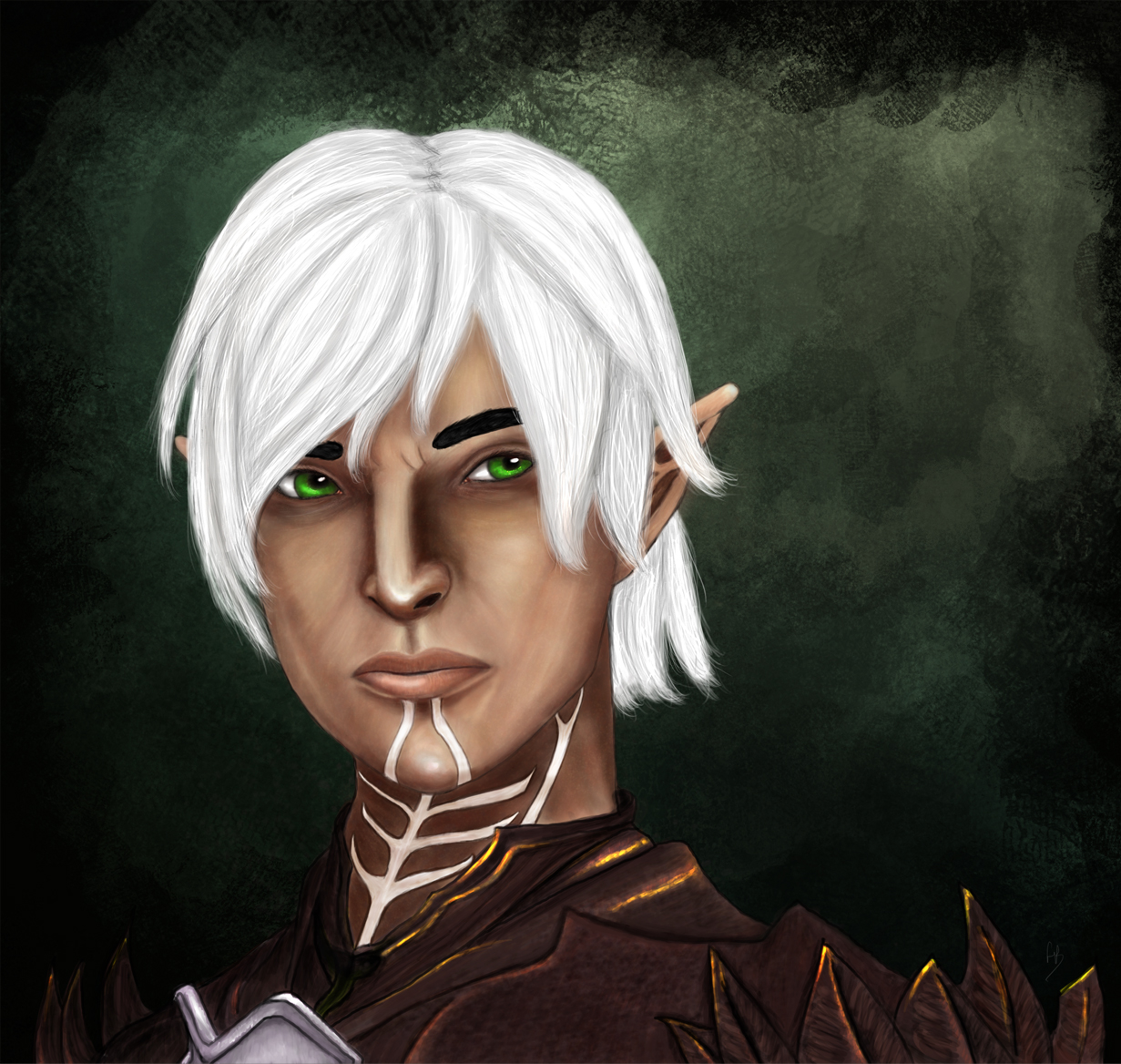
What the hell muse... I mean.. SHE BETTER BE SATISFIED NOW!
I was supposed to do a million other things, but instead I did a full blown Fenris portrait.
I also realized something.. Drawing Fenris makes me happy. Granted it also makes me want to tear my hair out, but that's just art in general.
1.) Worked on skin textures on this one.
2.) I'm afraid of shadows and I don't know WHY.. I feel like if I shadow too much it makes the colors wrong or something, and well.. I tried to work on shadows and depth.
3.) I took the title from my dear brain twin thebroodyelf. She gave me much needed support when I was drawing this.
So I'll dedicate My Fenris to you, my dear, and perhaps the next Fenris I do will be of Your Fenris
As always critiques and feedback appreciated. One day I will feel good about my art.. one day...
Image size
1231x1168px 816.73 KB
© 2011 - 2024 Arquen
Comments29
Join the community to add your comment. Already a deviant? Log In
First off, nice name! From the Fenris of Norse myth, right?
Your sense and use fo color is beautiful, from the gold on the armor to the dark green background. You use complimentary colors to your advantage, making this image look much more appealing.
That said, the white hair is extremely distracting. The ret of the picture has a large amount of contrast between its lights and darks (since the lighting is strong, and the setting is darker, as shown by the background). The hair lacks any real shading, so it looks a bit pasted on. The opposite is true for his eyebrows - they're extremely dark, with no light on them whatsoever. This makes them look misplaced as well. (I'm also a bit curious as to why his hair is white, but they're very dark).
If you add some more shadows to the hair (especially on the left of the piece), and some verrrrry tiny, very subtle highlights on the eyebrows, it'll really improve this piece.
Good luck, and keep drawing!